Basic Data Visualization
I want to learn some basic data visualization, so I I'll start by messing around with the sqrt function I created last time.
Creating a python module
I made my square root function in C, but I want to visualize the data using Python libraries. I could convert my code into Python I'm going to turn my C code into a python module using this guide on the Python docs. I don't know if this is the best solution but it'll be another good thing to learn.
After building and installing the module I'm able to call it in Python.
Using some test code
import sqrt

for i in range (5):
    print(sqrt.sqrt(10, i))
I get the correct output for different degrees of approximation of the square root of 10
3.0
3.1666666666666665
3.1620370370370368
3.162294238683127
3.162276377457704
Matplotlib
First I'm going to try to graph my square root function using Matplotlib and compare it with the Python sqrt function.
Here's my code where I think I used NumPy Correctly.
import sqrt
import matplotlib.pyplot as plt
import numpy as np

x = np.linspace(0, 100, 200)

def sqrt_list(list, terms):
    output = list.copy()
    for index in range(len(output)):
        output[index] = sqrt.sqrt(output[index], terms)
    return output

plt.plot(x, np.sqrt(x), color='black')

for i in range(1, 5):
    plt.plot(x, sqrt_list(x, i), color=(i * 0.2, 0, (1 - i * 0.2)))

plt.show()
Here's my plot where the black line is Python's square root line while my lines are more blue at lower accuracy, and more red and higher accuracy.
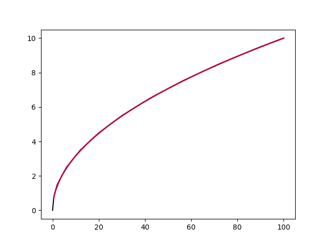
Well you really can't tell the lines apart, so let me try to graph the magnitude of the error instead:
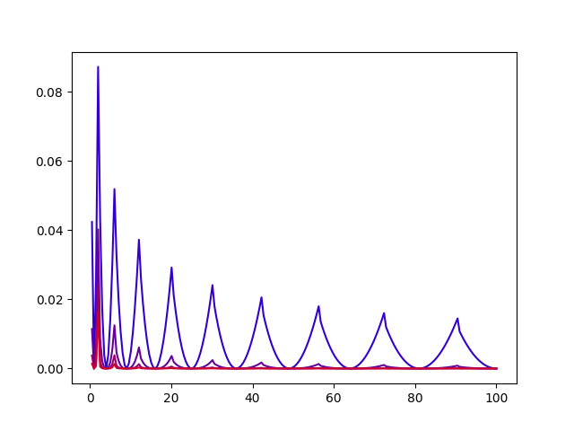
This is actually a really interesting plot that makes sense to me. The errors approach zero as the functions approach perfect squares. Conversely, the errors have peaks further from the perfect squares and these peaks get lower both for greater degrees of approximation, and as the input gets larger because of the flattening of the square root function.
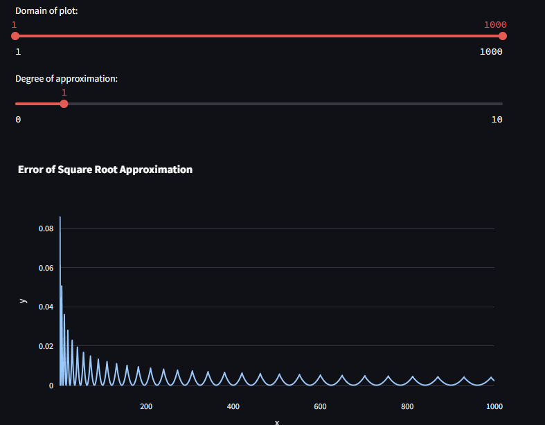
Streamlit
I want to make an interactive visualization as well, so I'm going to try to use Streamlit to do this.
Using a library called plotly, I deployed a basic website that allows modification of the domain and the degree of approximation:
import streamlit as st
import numpy as np
import plotly.express as px
import math
import sqrt

domain_min, domain_max = st.slider("Domain of plot:", 1, 1000, (1, 1000), 1)
approximation_degree = st.slider("Degree of approximation:", 0, 10, 1, 1)

x = np.linspace(domain_min, domain_max, (domain_max - domain_min) * 2)

def sqrt_error(domain, terms):
    output = domain.copy()
    for index in range(len(output)):
        output[index] = math.fabs(math.sqrt(output[index]) - sqrt.sqrt(output[index], terms))
    return output

y = sqrt_error(x, approximation_degree)

df = px.data.iris()
fig = px.line(df, x, y, title="Error of Square Root Approximation")

st.plotly_chart(fig)
I'm beginning to understand why python is so widely used now...
Wrapping Up
This was a good start for data visualization, that will be a useful tool for future projects!
Check out the Project Website and Source Code